
Page components
This is an example page of the components we use on dorsetcouncil.gov.uk. A page is different to a multi-content article, it has more visual components and is used for landing pages, to display menus and navigation tools.
Layouts
We can split a page into different layouts. The content can span the page like this, or split into two, with different spacing options, or broken into thirds or quarters. You can then drag any basic component into the layout, giving a different style. Such as a paragraph or image.
This layout includes a paragraph of text, with an image on the right hand side.
Layouts can also contain UI cards for navigation, a number of components can be dragged into any layout.
You can also change the background colour on a layout, we use white or this soft grey.
Images must always have an alt text which can be set in the description area.
Layouts can also contain UI cards for navigation, a number of components can be dragged into any layout.
You can also change the background colour on a layout, we use white or this soft grey.
Images must always have an alt text which can be set in the description area.
UI card (individual)
UI cards are used for navigation but are manual to set up. You need to add a title, description and image, and link the title. You have size options of large and small. These cards set out in a layout of 3 blocks means the order can be changed by dragging the UI cards. The only clickable element is the UI card title.
UI card title
UI card description
UI card title
UI card description
UI card title
UI card description
UI cards
These UI cards come as a block, you select how many you want and have size options of large and small, you cannot re-order these and they are also manual to edit like the individual UI card.
UI card description

UI card description

UI card description
Navigation cards
Navigation cards (or nav cards) display similarly to a navigation menu, but are manually set up not automatically generated based on menu/services. This means you can customise the heading and intro text/description. You can also leave the description out if you need to. The only part that is clickable is the title, where you can link to the article or page. You increase the number of cards in the configuration, you can not drag to amend the order.
Asset publisher
An asset publisher will pull through content to the page, it is most often used to display multi-content articles that live in the same folder as the landing page. For example, the school transport page will only show articles that have been tagged with 'school transport' as a service. There are many ways to configure an asset publisher. You cannot edit the text shown in an asset publisher within the page, as it's pulling through directly from the multi-content article.
Documents and media, and web content display
An asset publisher can also pull through a collection of documents. This is used in sections like planning where they have to publish an easy to view library of documents and means you don't have to add individual inline links. By tagging the documents you can more easily display a collection. You can also select a 'web content display' to pull through any web content, like text from a Multi-Content Article.
Standard asset publisher
Navigation menu
A navigation menu is the default menu used on the website, it is similar to the asset publisher in that it pulls through content for you, but only displays pages not multi-content articles. You can see a working navigation menu on the Dorset Council Tax web page. The navigation menu here is displaying what is in our footer.
Info card row
This is a simple way to display text in a grey box, you can select how many cards you like in the configuration and add simple text and links. They can be useful to display small amounts of information, opening times or statistics. As seen on the careers in planning team page.
Some example text in an info card row
Some example text in an info card row
Some example text in an info card row
Buttons
Featured content buttons
Used for top tasks where there is a clear action, 'apply for a permit' or 'pay a parking fine' for example. You can have up to 6 buttons and they display as seen, you can also use them for top tasks in a service.Call to action (CTA) button
Used to direct the user to a process, such as the start of a form they need to complete. This button is slightly different to those used in multi-content articles. It can be found in components labelled as 'accessible button'GDS warning text
This can be used to warn users about something important, such as legal consequences of an action, or lack of action that they might take. It shouldn't be overused. A deadline to apply for something for example would be another good use of the GDS warning text.
Warning
You can be fined up to £5,000 if you do not register.
GDS inset text
Use inset text to differentiate a block of text from the content that surrounds it, for example:
- quotes
- examples
- additional information about the page
Our average response time for a local land charge search is 10 working days.
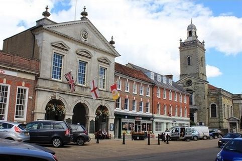
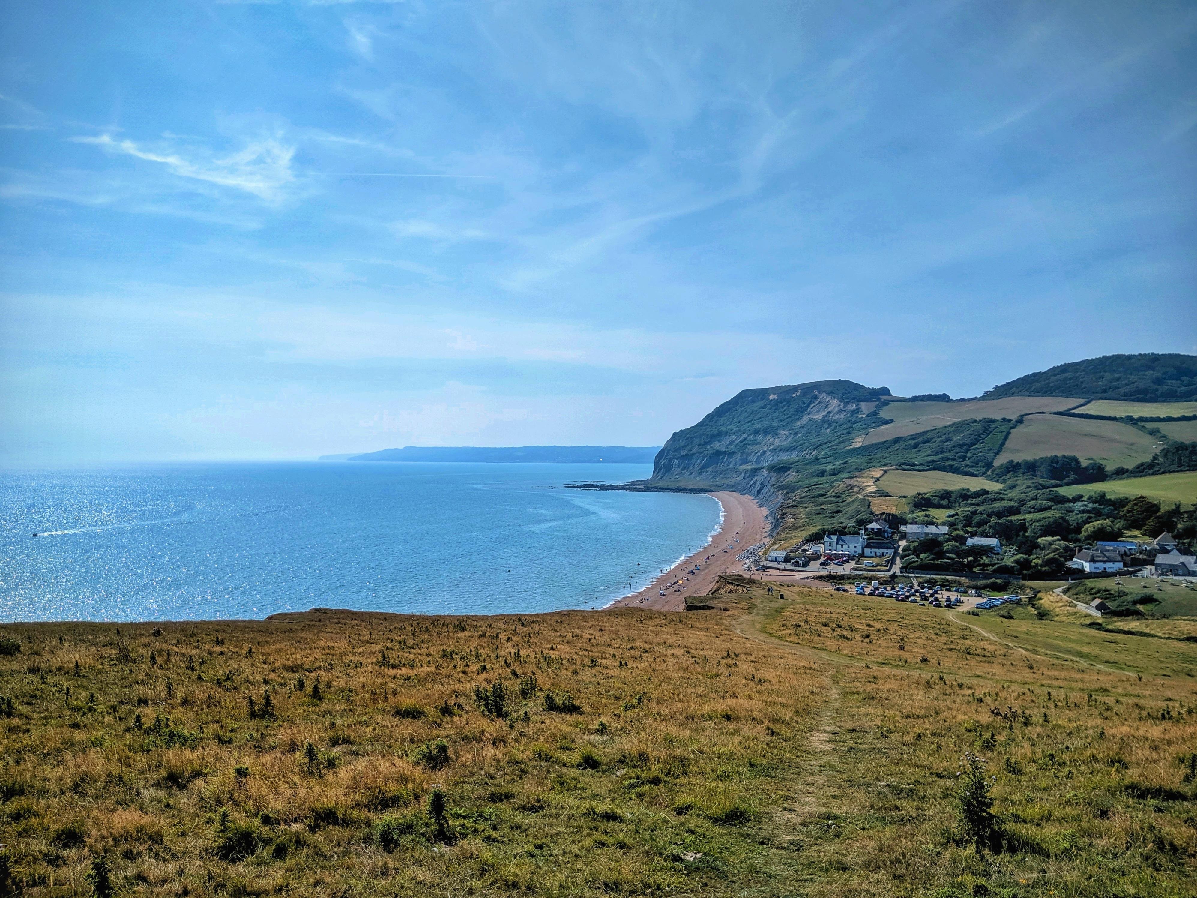
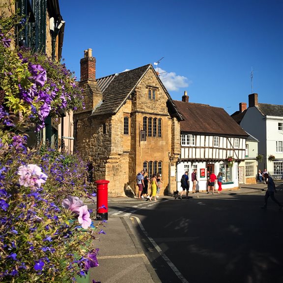
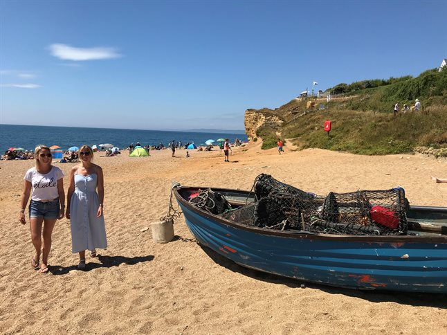
Landing page banners
A selection of visual components usually added to the top of a landing page. Only if images add something to the content will they be used on this website. They are not used on transactional pages like council tax, but are used on more traded sections such as leisure centres and country parks. There are 4 variations of landing page banners we use. The image size will depend on what you have uploaded, consider whether the focal point of the image will be blocked by text or a block, and use wepb to help download speed.